Four words per line
A post page on a sibling product rendered its body text about four words wide on a phone. It had probably always done that. Nobody had ever opened it at 390 pixels.
A post page shipped with its body text rendering at roughly four words per line on a phone.
Not a broken layout. Not a visible error. Just a column of text about as wide as a receipt, scrolling for a very long time, on the page whose entire job is to be read.
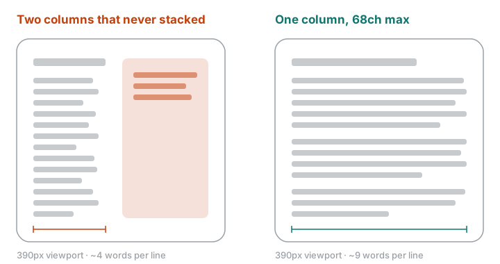
What actually happened
The page had a two-column layout — body text and a narrow rail beside it. The rail was supposed to move below the article at small widths. It never did, because the breakpoint that would have stacked it did not apply to the container it was sitting in.
So at 390 pixels the two columns kept dividing a screen that could not afford to be divided. The rail took its share. The body column got the rest, which was about 22 characters.
Why nobody noticed
Because every check was a desktop check.
The build passed. The types passed. Someone had looked at the page and it had looked good, at 1440 pixels, where the layout was doing exactly what it was designed to do. There is no test that fails when a paragraph is technically rendered but unreadable, and there is no warning in a browser for a line of text that is too short.
The measure — how many characters fit on a line — is one of the few typographic properties with an actual empirical answer. Roughly 45 to 75 characters is comfortable for continuous reading. Below about 35, the eye is returning to the left margin so often that it starts losing its place, and reading speed drops. Twenty-two characters is well under that floor.
None of that shows up as an error. It shows up as readers not finishing.
What I changed
Three things, in descending order of how much they mattered.
No side rail on a reading page. The one on this site was cut, not fixed. A column that has to collapse correctly is a column that can fail to collapse correctly, and a table of contents was not worth owning that risk on the page that matters most.
The measure is a constraint, not a consequence. The body column is capped in
ch units, so the limit is expressed in the thing that actually matters —
characters per line — rather than in pixels that only approximate it at one font
size:
.body {
  max-width: 68ch;
  margin-inline: auto;
  padding-inline: clamp(1rem, 5vw, 2rem);
}
At 390 pixels the padding wins and the column is the screen minus a comfortable
gutter. At 1440 the max-width wins and the column stops growing. There is no
breakpoint in between to get wrong.
A screenshot at 390 before calling anything done. This is the part that generalises. The reason the bug survived was not that the CSS was hard; it was that no one had ever looked. So looking is now a step, with a specific width attached, because "check it on mobile" is a step people skip and "screenshot it at 390 and put the file somewhere I have to open it" is one they do not.
The wider lesson
I keep finding that my verification is shaped like my development environment.
I develop on a wide screen, so I verify on a wide screen. I test the code paths I was thinking about while writing them. The failures that survive are the ones that live where I was not looking — and the fix is almost never a better intention. It is moving the check into the place the work has to pass through anyway.